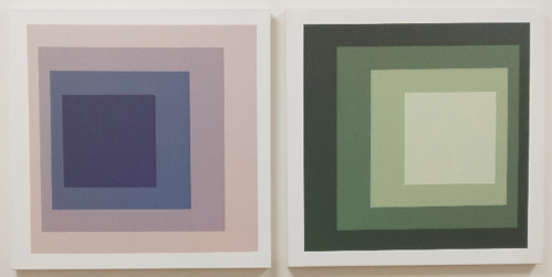
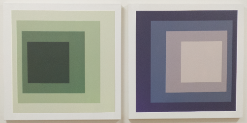
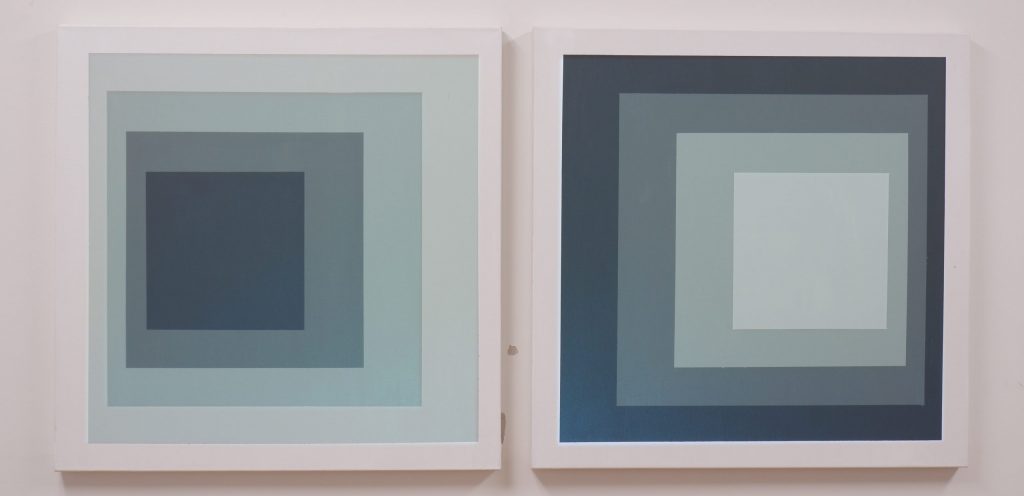
In this work, projected light modulates the color of two grayscale paintings. The paintings are based on the Homage to the Square series of paintings by Josef Albers, which includes two murals installed in the lobby of the Eastman Building on RIT’s campus. Albers’ work explored how spatial interactions influence our perception of color, how the color we perceive an area to be is affected by the color of the areas around it. This AR painting extends Albers’ exploration into the temporal domain through a MATLAB program that slowly changes the perceived color of each painted region, letting us experience how the colors we perceive now are influenced by the colors we have just seen.


The intention with this piece was to create perceptual ambiguity through the interaction between projected light and paint. Under most viewing conditions, the color of the painting appears to be only due to the paint, not the projector, which illustrates how our visual system computes color. When confronted with ambiguous stimuli, our brain has to make assumptions about which possible world is the most probable. In this case, we have to decide if we’re looking at colored paint under normal illumination, or gray paint under colored illumination that individually covers each square in the paintings. While we consciously know the second case to be true, our visual system might prefer the first case because it involves a less complex model of reality, and so we might perceive the color to be coming from the paint, not from the projector.
Similarly, even though we know that the canvas is flat, the interaction between the squares of different colors can give us a feeling of depth, and as the colors change, squares seem to recede or approach. Experiencing and manipulating the sensation of depth with such simple stimuli suggests that our perception of color directly codes into our depth perception.
This work also demonstrates differences between the color opponent channels in our brain. Our achromatic (white vs. black) opponent channel is dominant over our chromatic (red vs. green and yellow vs. blue) opponent channels in terms of edge detection and seeing fine detail. Here, the chromatic information projected onto the canvas is blurred compared to the sharp painted edges which provide the achromatic information. We don’t see or notice the blurriness of the projected color, though, because of the dominance of the achromatic channel. Instead, our visual system fits the blurry chromatic information to the sharp painted lines.
The artist is a second-year student in the PhD program in the Munsell Color Science Laboratory at RIT. He has been experimenting with combining light and painting for the past six months and hopes to continue exploring how subtle virtual interventions into the analog world can teach us about the human visual system and our perception of color. Feedback about what you see in his work is greatly encouraged!
